New Fonts for the New Year
The Google Font team is excited to announce the addition of a handful of high-quality web fonts for you to use freely on your website or blog. With this addition, the Google Font Directory has almost doubled in font selection compared to last month! We'd like to thank the font designers responsible for such a great collection of premium (and free) web fonts.
To use any of these new web fonts, simply click the "Use this font" tab on any of the font pages and paste the snippet into your pages. Google will take care of the rest. Without further delay, here is the all star lineup:
Introducing the Ubuntu Font Family to the web
Google and the Ubuntu project have today released the Ubuntu Font Family to the world through the Google Font Directory. The new Ubuntu Font Family debuted in the current Ubuntu 10.10 release of the Ubuntu operating system and is also available for download from font.ubuntu.com.
The main www.ubuntu.com site features the Ubuntu Font Family in-use from today (screenshot below). Through the magic of the Google Font API any web designer can now pick Ubuntu from the Google Font Directory and bring the beauty and legibility of the Ubuntu fonts to their websites too.
The Ubuntu typeface family is a set of new fonts in development throughout 2010–2011. The development is being funded by Canonical Ltd on behalf the wider Free Software community and the Ubuntu project, with the skilled font work being undertaken by Dalton Maag. Like everything else in Ubuntu, the fonts are free to use and legal to share, sell, bundle and build upon. The included “source code” allows remixing, improvement and expansion by anyone with the skills or an interest. This release includes Latin, Cyrillic and Greek support, and future versions will be automatically rolled out to everyone using the Google Font API.
 Mark Shuttleworth, founder of the Ubuntu project, commented: "Our focus on design and usability in Ubuntu led us to create a font which is at once beautiful and readable. We're delighted to share the Ubuntu Font Family with web designers around the world who want their websites to be stylish and readable in as many languages and browsers as possible. The publication of the Ubuntu font on the global Google Font Directory is an appropriate treat for the festive season, and we wish all those who contribute to, and enjoy the benefits of, free software and open content a very happy and healthy solstice and New Year."
Bruno Maag of the Dalton Maag type foundry, who have been working with Canonical on the design and technical implementation of the typeface commented, “It is unique in our company’s history to work on such a comprehensive high-quality font and to have it given to the World to use for free. The creativity and expertise that is available in the open source world, in particular the insight into language and script requirements, ensures that the fonts are a useful tool for everyone. The right font used correctly can increase accessibility to information and increase productivity. With today’s gift, we expect to see widespread adoption of the Ubuntu fonts from today, as it combines design at its best with simple distribution through the Google Font API.”

Google is excited to be providing such a high quality font to the world, with all of the benefits of web fonts including amazing searchability and accessibility. Web fonts demonstrate the true power of the web, as web pages can be translated and still preserve a rich visual presentation - something not possible with any other technology, especially baking text into images. The Canonical Design blog has a history of the fonts’ development and as the language coverage increases throughout 2011, users will automatically get those improvements along with the performance and reliability they can expect from Google. I hope that people have fun over the holidays adding the Ubuntu web fonts to their sites!
Posted by Raph Levien, Google Fonts
The main www.ubuntu.com site features the Ubuntu Font Family in-use from today (screenshot below). Through the magic of the Google Font API any web designer can now pick Ubuntu from the Google Font Directory and bring the beauty and legibility of the Ubuntu fonts to their websites too.
 The Ubuntu Website using the Ubuntu Font Family
The Ubuntu typeface family is a set of new fonts in development throughout 2010–2011. The development is being funded by Canonical Ltd on behalf the wider Free Software community and the Ubuntu project, with the skilled font work being undertaken by Dalton Maag. Like everything else in Ubuntu, the fonts are free to use and legal to share, sell, bundle and build upon. The included “source code” allows remixing, improvement and expansion by anyone with the skills or an interest. This release includes Latin, Cyrillic and Greek support, and future versions will be automatically rolled out to everyone using the Google Font API.
 Mark Shuttleworth, founder of the Ubuntu project, commented: "Our focus on design and usability in Ubuntu led us to create a font which is at once beautiful and readable. We're delighted to share the Ubuntu Font Family with web designers around the world who want their websites to be stylish and readable in as many languages and browsers as possible. The publication of the Ubuntu font on the global Google Font Directory is an appropriate treat for the festive season, and we wish all those who contribute to, and enjoy the benefits of, free software and open content a very happy and healthy solstice and New Year."
Bruno Maag of the Dalton Maag type foundry, who have been working with Canonical on the design and technical implementation of the typeface commented, “It is unique in our company’s history to work on such a comprehensive high-quality font and to have it given to the World to use for free. The creativity and expertise that is available in the open source world, in particular the insight into language and script requirements, ensures that the fonts are a useful tool for everyone. The right font used correctly can increase accessibility to information and increase productivity. With today’s gift, we expect to see widespread adoption of the Ubuntu fonts from today, as it combines design at its best with simple distribution through the Google Font API.”

Google is excited to be providing such a high quality font to the world, with all of the benefits of web fonts including amazing searchability and accessibility. Web fonts demonstrate the true power of the web, as web pages can be translated and still preserve a rich visual presentation - something not possible with any other technology, especially baking text into images. The Canonical Design blog has a history of the fonts’ development and as the language coverage increases throughout 2011, users will automatically get those improvements along with the performance and reliability they can expect from Google. I hope that people have fun over the holidays adding the Ubuntu web fonts to their sites!
Posted by Raph Levien, Google Fonts
Web fonts go mobile
Google Fonts now work for the vast majority of mobile devices, including Android 2.2+ devices, iPhone and iPad! And now with the recent release of iOS4.2, even non-latin scripts like Greek will render beautifully on the iPad and iPhone.
One of the biggest benefits of using the Google Font API is that the service removes the nuances involved with rendering web fonts correctly across all devices and platforms. As a user, you can simply choose which font you'd like, and Google will take care of the rest.

Want a peek behind the curtain? ... When a request for a web font comes into our servers, we detect the browser and device, and serve the font file format that works best on that device. For example, for older versions of iOS, which don't support the TrueType font format, we convert the font vectors into SVG format. Obviously, this is not something you'd want to do manually, for each device your users are on.
With this new mobile support, we think the value and simplicity of the Google Fonts are better than ever before.
New! Web Font Statistics
We're excited to announce the launch of two new features of the Google Font Directory.
1) Font level statistics
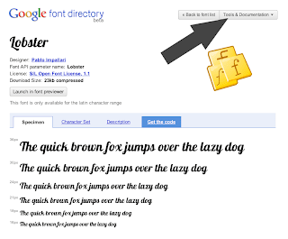
Curious to see which fonts get the most usage, how that usage is trending, or where in the world that font is used? Now you can visit the Info tab found on each one of the font pages to see these stats. See an example of the font Lobster here. The delta between the most and least popular font in the Directory is huge, which goes to show that some of our fonts (such as Lobster) have really found a niche on the web.

2) Sort by popularity
From the front page of the Google Font Directory, we've added a pull down that allows you to change sort order of the fonts. Now you can choose by font popularity! This sort order is based on the last 7 days of font requests.

1) Font level statistics
Curious to see which fonts get the most usage, how that usage is trending, or where in the world that font is used? Now you can visit the Info tab found on each one of the font pages to see these stats. See an example of the font Lobster here. The delta between the most and least popular font in the Directory is huge, which goes to show that some of our fonts (such as Lobster) have really found a niche on the web.

2) Sort by popularity
From the front page of the Google Font Directory, we've added a pull down that allows you to change sort order of the fonts. Now you can choose by font popularity! This sort order is based on the last 7 days of font requests.

Web fonts on the rise
We launched the Google Font Directory and Google Font API to help establish a core set of web fonts that can be used openly across devices and platforms. Recently, the team took some time to reflect on our progress, the adoption of web fonts in general, and on the current limitations. We'd like to share some of the most interesting stats from our analysis:

The adoption of the Google Font API has been fantastic, and we think it speaks to the potential of web fonts to change the web. Google isn’t the only player in this space to see promising adoption stats. In order to fully assess the state of the web font ecosystem, we worked together with our friends at Typekit. They performed a similar analysis and their results are equally exciting.
Although there is a long way to go for comprehensive browser and device support (especially for complex scripts like Arabic), we are highly optimistic. With web font adoption quickly gaining momentum, there will be increased pressure on the browsers and platforms of the world to support web fonts in a standard and consistent manner. But we need your help! If you have interesting example uses of web fonts, feature requests for the Google Font API, or encounter problems, please let us know by posting on our feedback page. Here’s to a bright web font future!
- The Google Font API currently serves over 17 million requests [1] a day to users across the globe.
- We’ve seen a 30% month-over-month growth rate since we launched. (This corresponds to over 20x year-over-year growth.)
- Roughly 400,000 unique websites [2] use the Google Font API.

The adoption of the Google Font API has been fantastic, and we think it speaks to the potential of web fonts to change the web. Google isn’t the only player in this space to see promising adoption stats. In order to fully assess the state of the web font ecosystem, we worked together with our friends at Typekit. They performed a similar analysis and their results are equally exciting.
Although there is a long way to go for comprehensive browser and device support (especially for complex scripts like Arabic), we are highly optimistic. With web font adoption quickly gaining momentum, there will be increased pressure on the browsers and platforms of the world to support web fonts in a standard and consistent manner. But we need your help! If you have interesting example uses of web fonts, feature requests for the Google Font API, or encounter problems, please let us know by posting on our feedback page. Here’s to a bright web font future!
Posted by David Wurtz, Product Manager, Google Font API
[1] A request is a single call to the Google Font API for one or more fonts.
[2] We count a unique website as unique domains, except that “www” subdomains are not counted. For example, www.myblog.com and myblog.com would count as one domain. However, sam.myblog.com and sally.myblog.com would count as two domains.
[2] We count a unique website as unique domains, except that “www” subdomains are not counted. For example, www.myblog.com and myblog.com would count as one domain. However, sam.myblog.com and sally.myblog.com would count as two domains.
Navigate the font directory more easily and submit your fonts
To make it easier for you to navigate all the tools and documentation that are part of the Font API we have created a unified navigation for the directory.
The directory pages now show a new dropdown menu at the top that takes you to our documentation pages, blog, previewer and other tools very quickly. Don’t forget to check out our new chrome extension as well.
The directory pages now show a new dropdown menu at the top that takes you to our documentation pages, blog, previewer and other tools very quickly. Don’t forget to check out our new chrome extension as well.
Submit your font or tell us where you have used the Font API
In the new navigation you will also find two new forms we have created for you. If you are a font designer and would like to see your font as part of the directory fill out our font submission form and tell us about it.
Have you created a website and used the Font API in a creative way? We would love to hear about that, too.
We are working hard to improve our service and the directory. If you have any suggestions you can always give us feedback on our moderator page.

Interview with Danh Hong, designer of Hanuman
As you may know, the Google Font team recently launched a small handful of non-latin fonts in the Google Font Directory, including Cyrillic, Greek and Khmer. We recently got a hold of Khmer font designer, Danh Hong, to describe his Cambodian font Hanuman and what went into and motivated its creation.
Q: What inspired you to create the Hanuman font?
It comes from my inspiration to have high quality Khmer fonts for both computers and mobile devices. My Khmer language is complex, and the typeface is rich. So I thought the new font technology we have today can help people to use the Khmer language on their computers and devices, and can save Khmer culture in digital age. Windows ships with a Khmer font, but it is small and hard to read. However, Mac OS X and the iPhone don’t ship with a Khmer font yet, and these products are getting usage in the Cambodian market.
Q: Did you try to accomplish something specific with this font, and did you succeed?
The challenge with Khmer is that it has many levels (above and below) so Khmer paragraph’s take up more vertical space than the same paragraph in English. My goal was to compress the Khmer letters so they would be compatible or similar to the metrics of English characters. I also wanted to merge OpenType and AAT together, so this behavior works with all Windows, Linux and Mac OS X devices.
Q: What kinds of documents are most appropriate for this font?
Because it is similar size to English text, it is best for scenarios that have a mix of Khmer and English text. I think it is good for books, daily newspapers and dictionaries. And because it is serif, it looks good for formal letters as well.
Q: Designing a new font is a long journey. What inspires you to keep motivated throughout all the different stages?
The creativity makes me feel happy. I always feel good when I can do new things, and my life is meaningful.
Q: What is your favourite part of the type design process, and why?
This is a difficult question! My favorite part is always changing. For old TrueType fonts, creating new typeface is interesting, but for OpenType, the “smart” behavior embedded into fonts is my favorite. I also enjoy hinting, because it can make the text clear to read.
Q: Can you recommend how other type designers can learn the skills involved in making Khmer fonts?
I recommend that potential Khmer type designers to learn Khmer art and old text, in addition to western typography. New things sometime come from mix between the traditional and modern technology.
Q: What are your favourite fonts, and why?
My favorites are handwriting fonts, because they are very natural.
Q: What do you think could be improved about the type design process?
Hinting is always hard work. Right now, there doesn’t exist an auto hinting tool that can do better than hand, but I think it is possible in the future.
International Fonts Launch Today
Today is a big day for the Google Font API. We have officially added our first non-Latin fonts to the Google Font API and Google Font Directory. Our additions include high quality web fonts for the Cyrillic, Greek, Hebrew, and Khmer scripts. That puts our total offering at 6 scripts, with over 25 unique font families and around 60 fonts in the Directory.
This launch marks a significant milestone for the web. We believe web fonts are critical not just for Latin-based scripts, but for all the world's languages. Fonts are a means of expression, and our choice of fonts freely available on the web should be large enough to allow for many different types of communication. In the coming months, the Google Font API team plans to expand our international coverage across even more scripts.
It's easy to take the variety of Latin web fonts for granted, but we have to remember that some scripts have no web fonts available at all. In these cases, users are required to download “font packs” to display the fonts correctly or they suffer from a poor web surfing experience:
A Khmer snippet properly displayed as a web font:

A Khmer snippet when the reader's computer does not have the correct font installed:

The creation of these web fonts is a labor intensive task that takes incredible patience, attention to detail, and skill. We'd like to thank all the immensely talented type designers that contributed to this launch, including Danh Hong, SIL International, the Greek Font Society, ParaType, and Jovanny Lemonad.
If you use a script that you would like to see supported by the Google Font API, please get in touch with our team through our moderator page. If you are a type designer with experience in designing for a script and you would like to contribute an original font family, we are actively soliciting commission proposals through this Proposal Form.
A more fontastic Google Docs
(Cross-posted from the Official Google Blog and the Google Docs Blog)
Documents without font choices are like photographs without colors. Just as shades of color can add depth to a picture, smart font choices give your text another dimension.
For a long time, the set of fonts that you’ve seen when you browsed the web has been quite limited. That’s because you could only use a font that’s already been installed on your computer. So if a website designer wanted all her visitors to see the same thing, she could only use fonts that are so ubiquitous that the chances are very high that every computer will have them. And there are only a handful of fonts that fit that bill.
Thankfully, that situation is changing. All modern browsers now support the ability to download web fonts. A web font doesn’t need to be installed on your local computer—it can be read directly from a web server and used immediately on the webpage that you’re loading. In May, we launched the Google Font API, which makes it easy for website developers to include any one of an ever-growing list of web fonts on their pages. We’re already using the new API for the latest themes in Google forms.
As of today, Google documents supports web fonts (using the Google Font API) and we’re excited to announce six new fonts.
Droid Serif and Droid Sans
Android fans will already be familiar with the Droid family of fonts. Droid Serif and Droid Sans both feature strong vertical lines and a neutral, yet friendly appearance. They’re designed specifically for reading on small screens.

Calibri and Cambria
Every day we have many people import documents from Microsoft Word into Google Docs. Today we’re making import fidelity better by adding two of the most popular Microsoft Word fonts. Calibri is a beautiful sans serif font characterized by curves and soft edges. It’s designed to be high impact. Cambria is built with strong vertical serifs and subtle horizontal ones. It’s very legible when printed at small sizes.

Every day we have many people import documents from Microsoft Word into Google Docs. Today we’re making import fidelity better by adding two of the most popular Microsoft Word fonts. Calibri is a beautiful sans serif font characterized by curves and soft edges. It’s designed to be high impact. Cambria is built with strong vertical serifs and subtle horizontal ones. It’s very legible when printed at small sizes.

Consolas and Corsiva
Consolas joins Courier New as the second monospaced font in Google Docs. It’s a modern monospaced font with character proportions that are similar to normal text. Finally, Corsiva is our first italic font with embellished characters and an elegant style.

Consolas joins Courier New as the second monospaced font in Google Docs. It’s a modern monospaced font with character proportions that are similar to normal text. Finally, Corsiva is our first italic font with embellished characters and an elegant style.

Right now our font support covers most Latin and Western European character sets. However, we’ll be adding web fonts for other languages (like Hebrew and Greek) soon. If you don’t see the new fonts in your documents, check that web fonts are supported in your language and that the document language is set correctly from the File -> Language menu.

This is just the beginning of fonts in Google Docs. We added six new fonts today and we’re already testing our next batch. You’ll see many more new fonts over the next few months. And because Google Docs uses web fonts, you’ll never need to install a new font: when you load your document, the latest set of fonts will always be there, ready to use.
Finally, adding web fonts is just one of the challenges that we have been working on. If you’re interested in learning more about the challenges of building a collaborative application, check out the first post of a three-part series on collaboration posted earlier today.
Optimizing the use of the Google Font API
At Google, we're absolutely obsessed with making the web faster, and delivering the lowest possible latency to users. Naturally, with the Google Font API, we're concerned with how to minimize the performance impact of web fonts. This post presents a number of best practices for optimizing performance and also summarizes the results of extensive measurements with real-world integrations.
First, the recommendations:
1. Combine multiple fonts into one request.
One pattern we see frequently is a separate <link> tag for each of the font requests. Many users don't seem to know that you can easily combine multiple font requests into a single tag, just separating the fonts with a | character.
So, instead of:
write:
This simple trick will save one roundtrip to the server for each additional font requested, and also protect against blocking on older browsers which only have 2 connections open per domain at a time.
2. Don't put the @import in an external CSS
Unfortunately, Internet Explorer has bad performance when one external CSS file links to another using an @import directive. If it weren't for performance issues, it would be good to have the extra flexibility of putting the @import in the same CSS file that uses the fonts, but for best performance, put the <link> tag in the base HTML file.
When that's done, the Font API CSS will usually load in parallel with other external CSS files in the page.
3. Put the font request early
You should try to place the Font API link right after the opening tag. In general, the Font API link should never go after a <script> tag. As Steve Souders has pointed out in his blog post (http://www.stevesouders.com/blog/2009/10/13/font-face-and-performance/), if there's a script tag before the @font-face declaration, Internet Explorer won't render anything on the page until the font file is done downloading.
4. Don't ask for fonts you don't use
This may seem obvious, but if you don't actually use a font, don't request it in the API. You might miss this if you do your testing in Firefox or Chrome, which only load the font files needed to render the text on the page. Internet Explorer, by contrast, loads all the fonts requested, even if they’re not actually used.
5. Use tools to analyze your page's performance
An excellent resource is webpagetest.org, which runs your page in an instrumented IE browser, and displays waterfall graphs and other information. It’s also a great idea to use the “Inspect Element” resource graphs in Chrome. Also be sure to follow Steve Souders' blog, which contains tons of useful information about improving performance of web fonts.
Let’s take a closer look at a well-designed site, the home page of the Government of Chile (http://www.gobiernodechile.cl/). This is a (partial) resource timeline from Inspect Element in Chrome over a 3Mbps DSL connection: </script>

The second resource (“css”) is the invocation of the Google font API. As you can see, the request is placed very early in the waterfall, and a number of other requests are served in parallel. Around the time the first round of Javascript is done loading, the page is rendered for the first time (the blue line), and a second round of resources are loaded, also in parallel, including the two “font” resources. This waterfall clearly shows that the font requests aren’t blocking any other resources on the page. If the font request had been an @import in an external CSS, the waterfall would have been different.
Running the same page on webpagetest.org (Internet Explorer 8) shows similar results with respect to the font resources (only first 20 requests shown):

Unlike in Chrome, the Javascript requests of lines 6-9 do serialize (the fact that Chrome is much faster than IE is not just marketing!), but the font API request (line 12) and the font data (line 13) are, just as in Chrome, loaded in parallel. Rendering is, however, blocked until the font data is complete. To make font loading entirely asynchronous and avoid any possibility of blocking the rendering, use the Webfont Loader library. Note that parallel loading will not always be the case, but if you follow the recommendations above, there’s a very good chance of it, and it is always a good idea to use these tools to analyze and optimize the performance of your site.
We’re working with browser vendors (IE9 in particular) to fix the fact that rendering blocks on the font data.
A larger scale analysis of latency impact
To make sure that our recommendations are sound, and that we’re using the best strategy to serve web fonts, we did a detailed quantitative analysis of the impact of web fonts on page load time. We chose 28 popular sites that use the Google Font API, and measured the page load time both with web fonts and with the request to the Font API disabled. Each experiment ran 200 times, with three simulated network speeds: fast (roughly 100Mbps), medium (3Mbps), and slow (384kbps). All the tests were run on Internet Explorer 8, instrumented to report the page load time.
Each of the following graphs shows a distribution of the difference of the mean page load time with and without fonts. As you can see, on fast connections the distribution is consistent with a Gaussian curve centered around zero. In fact, the mean increase in page load time is 37ms (+/- 137ms), so a reasonable conclusion is that there is no measurable impact on page load time. Note that most webpages have a very high variance in page load times, so getting measurements more precise than a few hundred milliseconds is not feasible.
Fast (~100Mbps):

At medium network speeds, there seems to be a bias toward increasing page load times, with all samples save one coming in at between 0 and 500ms. Even so, the mean increase was only 34ms (+/-195ms), so the effect is barely significant.
Medium (3Mbps):

Finally, on slower connections, it is possible to see a definite impact on overall page load times, ranging from 250ms-1.5s for all but two of the samples. At these speeds, the mean increase is definitely significant, at 1016ms (+/- 302ms).
Slow (384kbps):

We wanted to find out exactly what was causing this impact on page load time on slower connections. A reasonable hypothesis is that it’s the bytes themselves. Thus, we made a scatterplot with the total (compressed) size of the fonts on the horizontal axis, and the delta page load time on the vertical. This plot shows a clear linear relationship:

Thus, users on high-bandwidth connections can enjoy web fonts with little or no impact on performance -- the web font request is served in parallel with the other elements on the page. Users on slower connections will see the impact of the additional bytes served. Fortunately, our team is working on ways of compressing font files even further, and users of the Google Font API will see the performance benefits as soon as this work is complete, with no additional effort.
First, the recommendations:
1. Combine multiple fonts into one request.
One pattern we see frequently is a separate <link> tag for each of the font requests. Many users don't seem to know that you can easily combine multiple font requests into a single tag, just separating the fonts with a | character.
So, instead of:
<link rel="stylesheet" type="text/css" href="http://fonts.googleapis.com/css?family=Droid+Sans">
<link rel="stylesheet" type="text/css" href="http://fonts.googleapis.com/css?family=Lobster">
write:
<link rel="stylesheet" type="text/css" href="http://fonts.googleapis.com/css?family=Droid +Sans|Lobster">
This simple trick will save one roundtrip to the server for each additional font requested, and also protect against blocking on older browsers which only have 2 connections open per domain at a time.
2. Don't put the @import in an external CSS
Unfortunately, Internet Explorer has bad performance when one external CSS file links to another using an @import directive. If it weren't for performance issues, it would be good to have the extra flexibility of putting the @import in the same CSS file that uses the fonts, but for best performance, put the <link> tag in the base HTML file.
When that's done, the Font API CSS will usually load in parallel with other external CSS files in the page.
3. Put the font request early
You should try to place the Font API link right after the opening tag. In general, the Font API link should never go after a <script> tag. As Steve Souders has pointed out in his blog post (http://www.stevesouders.com/blog/2009/10/13/font-face-and-performance/), if there's a script tag before the @font-face declaration, Internet Explorer won't render anything on the page until the font file is done downloading.
4. Don't ask for fonts you don't use
This may seem obvious, but if you don't actually use a font, don't request it in the API. You might miss this if you do your testing in Firefox or Chrome, which only load the font files needed to render the text on the page. Internet Explorer, by contrast, loads all the fonts requested, even if they’re not actually used.
5. Use tools to analyze your page's performance
An excellent resource is webpagetest.org, which runs your page in an instrumented IE browser, and displays waterfall graphs and other information. It’s also a great idea to use the “Inspect Element” resource graphs in Chrome. Also be sure to follow Steve Souders' blog, which contains tons of useful information about improving performance of web fonts.
Let’s take a closer look at a well-designed site, the home page of the Government of Chile (http://www.gobiernodechile.cl/). This is a (partial) resource timeline from Inspect Element in Chrome over a 3Mbps DSL connection: </script>

The second resource (“css”) is the invocation of the Google font API. As you can see, the request is placed very early in the waterfall, and a number of other requests are served in parallel. Around the time the first round of Javascript is done loading, the page is rendered for the first time (the blue line), and a second round of resources are loaded, also in parallel, including the two “font” resources. This waterfall clearly shows that the font requests aren’t blocking any other resources on the page. If the font request had been an @import in an external CSS, the waterfall would have been different.
Running the same page on webpagetest.org (Internet Explorer 8) shows similar results with respect to the font resources (only first 20 requests shown):

Unlike in Chrome, the Javascript requests of lines 6-9 do serialize (the fact that Chrome is much faster than IE is not just marketing!), but the font API request (line 12) and the font data (line 13) are, just as in Chrome, loaded in parallel. Rendering is, however, blocked until the font data is complete. To make font loading entirely asynchronous and avoid any possibility of blocking the rendering, use the Webfont Loader library. Note that parallel loading will not always be the case, but if you follow the recommendations above, there’s a very good chance of it, and it is always a good idea to use these tools to analyze and optimize the performance of your site.
We’re working with browser vendors (IE9 in particular) to fix the fact that rendering blocks on the font data.
A larger scale analysis of latency impact
To make sure that our recommendations are sound, and that we’re using the best strategy to serve web fonts, we did a detailed quantitative analysis of the impact of web fonts on page load time. We chose 28 popular sites that use the Google Font API, and measured the page load time both with web fonts and with the request to the Font API disabled. Each experiment ran 200 times, with three simulated network speeds: fast (roughly 100Mbps), medium (3Mbps), and slow (384kbps). All the tests were run on Internet Explorer 8, instrumented to report the page load time.
Each of the following graphs shows a distribution of the difference of the mean page load time with and without fonts. As you can see, on fast connections the distribution is consistent with a Gaussian curve centered around zero. In fact, the mean increase in page load time is 37ms (+/- 137ms), so a reasonable conclusion is that there is no measurable impact on page load time. Note that most webpages have a very high variance in page load times, so getting measurements more precise than a few hundred milliseconds is not feasible.
Fast (~100Mbps):

At medium network speeds, there seems to be a bias toward increasing page load times, with all samples save one coming in at between 0 and 500ms. Even so, the mean increase was only 34ms (+/-195ms), so the effect is barely significant.
Medium (3Mbps):

Finally, on slower connections, it is possible to see a definite impact on overall page load times, ranging from 250ms-1.5s for all but two of the samples. At these speeds, the mean increase is definitely significant, at 1016ms (+/- 302ms).
Slow (384kbps):

We wanted to find out exactly what was causing this impact on page load time on slower connections. A reasonable hypothesis is that it’s the bytes themselves. Thus, we made a scatterplot with the total (compressed) size of the fonts on the horizontal axis, and the delta page load time on the vertical. This plot shows a clear linear relationship:

Thus, users on high-bandwidth connections can enjoy web fonts with little or no impact on performance -- the web font request is served in parallel with the other elements on the page. Users on slower connections will see the impact of the additional bytes served. Fortunately, our team is working on ways of compressing font files even further, and users of the Google Font API will see the performance benefits as soon as this work is complete, with no additional effort.
By Raph Levien and Jeremie Lenfant-engelmann, Engineers on the Google Font API Team
Subscribe to:
Posts (Atom)